Welcome to the Ryver Product Ideas forum! We pride ourselves on constantly improving Ryver based on customer feedback. Here, you can view and vote on the current list of feature ideas, or add your own idea if you don't see it.
For immediate support, go to https://support.ryver.com and click the Chat tab in the lower left. You can also request help from the Send Feedback link in the top drop-down menu in the application nav bar.

 Add Evernote as file attachment option
Please add Evernote to the list of file attachment integrations. My office has recently taken to Evernote as a fish does to water and being able to link these notes to our Ryver posts and discussions would be very helpful.

Improve interface and usability with posts.
My users find the interface confusing when up to 3 boxes pop out from the right of screen when clicking on posts. If the underlying interface greyed-out, it would make it much clearer to users what they were looking at.
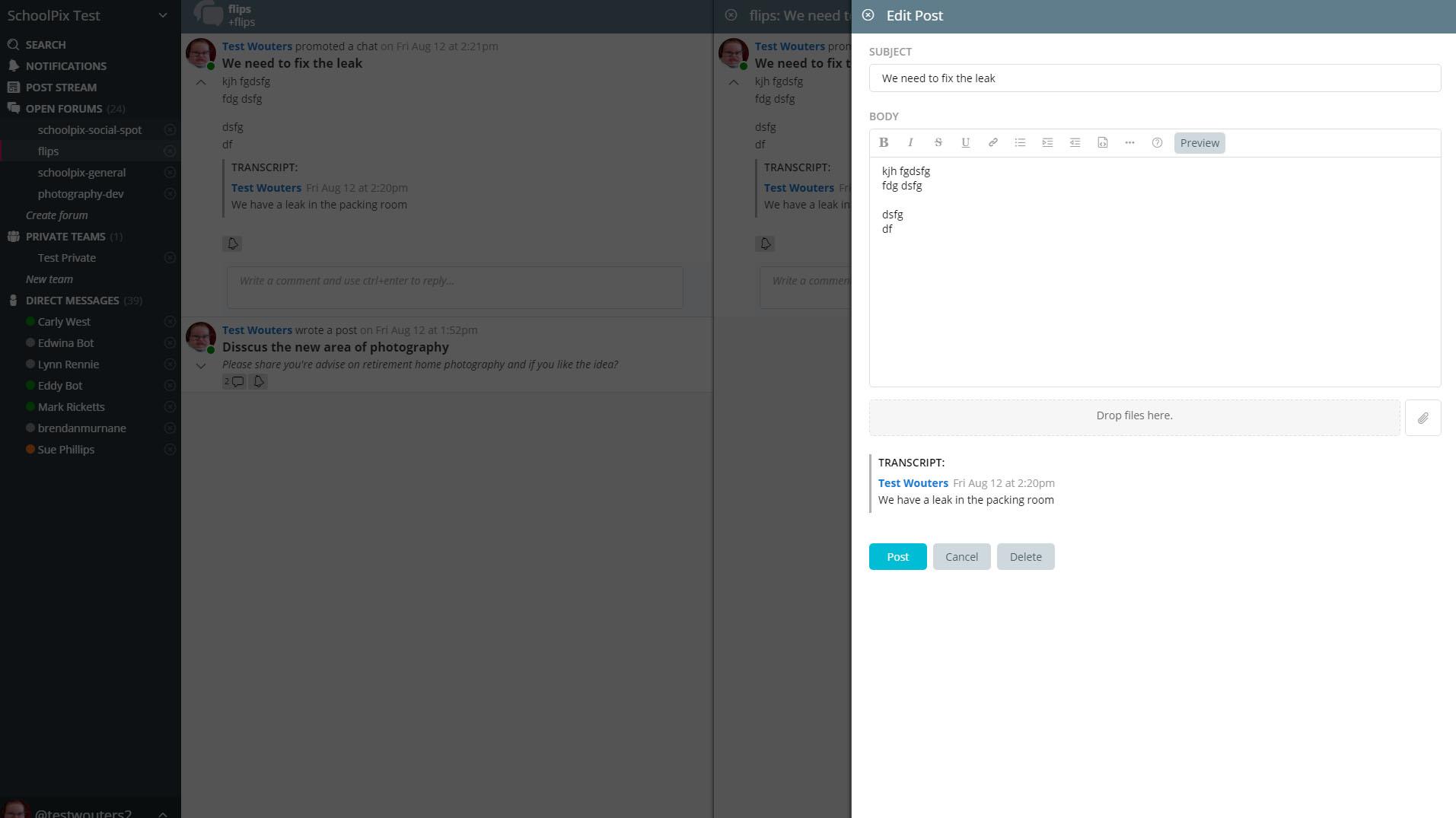
Greyed-out underlying window would help users understand they are editing the post.
Also confusion to why the same post pops out from the right when you click on a post title? Very Confusing!
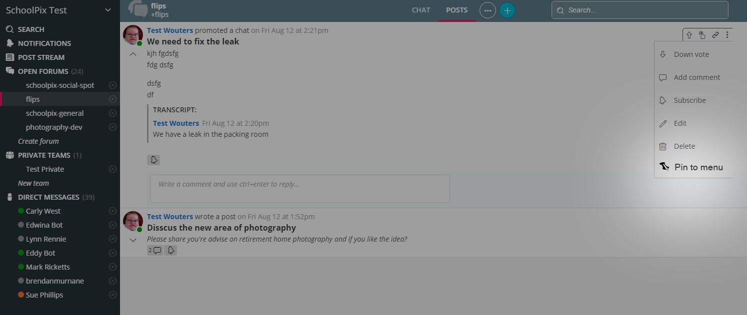
Very randomy, some posts would apear pinned to the menu, however I can find no way to recreate it.

View messages in a forum or team without getting pinned
As a administrator of many different private teams that I do not engage with on a daily basis, I want the ability to view the chat messages without having each one pinned to my navigation bar. This could work by sliding in the forum or team if I click on it without pinning it unless I explicitly do so.

Icon to show user platform
It would be nice if there was a way to tell what platform a user is on. A little icon next to their name to signify Mobile, PC, Web, etc would be quite helpful for a company with a lot of people that come & go often.

Chat that utilizes PageUp/Dn Home/End
Simple where I am coming from: If I scroll up to view old chats.. I want to hit the end key to get back to the bottom. I understand that home should probably only go up as high as your current buffer, page up might take some buffer limitations as well. But Page down and End would be sweet!

Collapse options at top to free up vertical screen real estate
Ryver has too many options displayed at the top of the screen wasting significant vertical real estate. Slack does a much better job at collapsing this to 1 line and requires much less scrolling to view actual content vs. ryver. This is particularly bad on the app and smaller screens. On my phone (which is no slouch at 5.2") I see roughly 25% less content in ryver vs. slack due to the wasted real estate at the top of the screen. The same goes for desktop. With laptop LCD manufacturers moving to wider screens the vertical real estate has taken a hit and is at a premium. This is why you see the major browsers removing all those needless options at the top of the screen and putting them in a menu bar to the right. Slack does a great job of collapsing menus and options onto a single line to free up vertical real estate. In ryver so much vertical real estate is wasted. For example, when viewing a forum, the name of the forum is on a line by itself (and in an excessively large font). The next line has chat, posts, files, guests, etc. which I suspect is rarely used wasting another line of real estate. To make things worse this is followed by at third line with search, refresh, etc. Could this all be condensed to a single line with a menu? And better yet using a not so huge font size. Would free up soooo much viewable vertical real estate.
Highlight unread forums without having to change pin order to most recent
One thing that is sorely lacking in ryver (vs. slack) is the ability to quickly see if you have unread items. When I am in the desktop version of slack it automatically displays "more unreads ^" or "more unreads v" in the navigation pane to the left when there are unread channels or direct mesages above or below the current view in the scroll. Better yet, in their app it automatically displays unread items at the top, followed by all channels in alphabetical order. Please add this best practice to ryver. In ryver the only way I've found to easily see if you have unread items is to change the pin order to most recent . This is great for seeing if you have unread forums but a nightmare when you want to scroll down to find a particular forum (because they are no longer in alphabetical order). If you set the pin order to alphabetical that is great for finding forums but you have to scroll up/down to find unread forums or DMs but without the assist you get in slack that there are unread items above or below. Also, in slack when you hit ctrl+k it shows you all your unreads. Ryver doesn't. This is pretty much core functionality in slack that is missing in ryver. Please add an option to display unread items at the top of the pane (this is crucial for mobile and would be nice to have for desktop) and/or add the "unread above" and "unread below" assist.

Notification or Flag when a direct message was sent a while back
Right now if a direct message is sent it bring up a notice on the bottom right, but I'm away from machine there is nothing that let's me know I have received direct messages. You are required to scroll down to see the highlighted persons name.
Could it be an option to show up in the Notifications tab or use a label like HipChat does to let you know that there is an unread message above / below?

 Clicking reply twice doesn't work correctly
When you click reply on two messages you will get this (Windows client used):
> *Name1 said:*
> Message1> *Name2 said:*
> Message2
instead of for example
> *Name1 said:*
> Message1
> *Name2 said:*
> Message2
So I think 1 or 2 newlines should be added in this case, another way to do it would be to allow replying to multiple messages at once. This would mean you need a way to select multiple messages at once, that could also work well together with the promote to post function.

Post Streams: names of forum/team not updated
Try updating the name of a forum or team and check your post streams.
New names aren't updated in the list
Example
1. Ryver wrote a post for "idea forum"
2. change idea to "new idea forum"
3. Check post streams -> new name not updated -> we should see Ryver wrote a post for "new idea forum" instead of "idea forum"
minor bug, but still a bug
Customer support service by UserEcho


