0
Under review
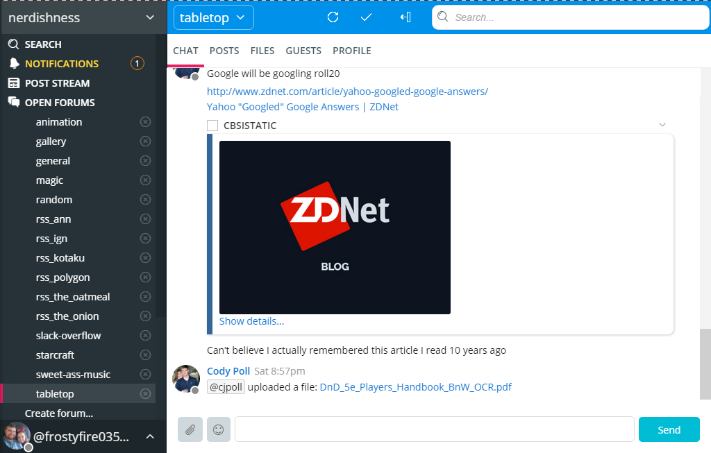
Putting "Search" in a conventional location in the desktop app
I would like to suggest moving the search bar, refresh icon, multi-select icon, and the online users toggle icon. It would seem to me better to have them in a convnetional place like many search bars are in the top right corner. It removes the trapped space around the "Chat" "Posts" bar, and it frees up some real estate for the actual chats themselves.


0
Under review
jeff 8 years ago
Customer support service by UserEcho

