- PRODUCT IDEAS
-
 Ideas
Ideas

+2
Started
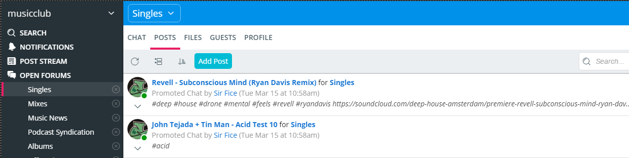
Clean up posts tab listings so they're easier to scan/read
Show the title and forum name only (or only show the forum name in the main post stream), and move the byline information(how this was posted, by who) to the actual byline (Date).
Customer support service by UserEcho

This is good feedback. We should have had the Subject on its own line so that it stands out better. We have gone ahead and made a styling change that we'll roll out next week. We may continue to iterate on it as well. In addition to making the Subject stand out more, we dropped the "for Team/Forum" part since that is unnecessary when you are on the POSTS tab. We will still show that info if you are on the main POST STREAM.
Yes, this is a great change. Putting important information in Posts doesn't do us any good if we can't find it later. I actually suggest putting the Topic on the top in bold - who wrote it and when isn't necessarily something I care to see in collapsed mode at all.
Let me know if this should be a separate request - Change How Posts Open. When I'm viewing the list of Posts, if I click on a Post Title, I don't want it to expand - I want it to open as an overlay, so I can focus on it. The current expansion is difficult to read given the other surrounding posts.
How about adding a more dominant distinction between posts, if you have several expanded they can easily run together. Maybe a thicker or bolder line between posts or maybe highlight the header row in a different color or even alternate colors like used in a table with alternating row colors so that you could make out where a new post starts with ease.